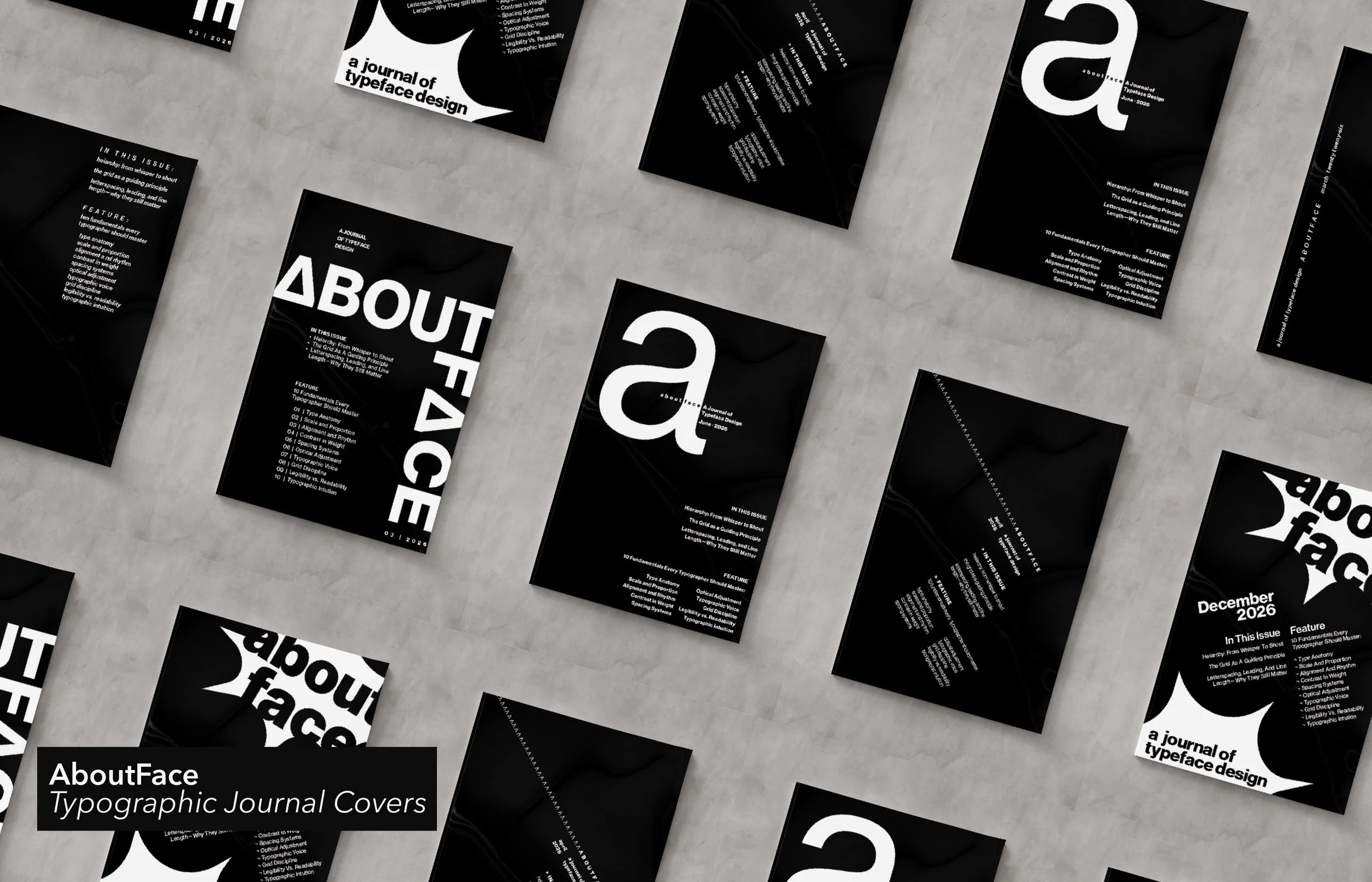
This series of typographic journal covers explores limitations in design. Using Neue Haas Grotesk, a black-and-white color scheme, and the same set of content across all five covers, each design responds to a different set of constraints involving type size and weight. The restrictions progress from a single size and weight to full typographic freedom with the addition of shapes and rules. This project emphasizes just how far you can push type, and shows how important thoughtful design decisions are to effectively communicate a message.
The content was created for a typographic journal titled "AboutFace" and features four articles, including a lead feature highlighting ten typographic fundamentals.
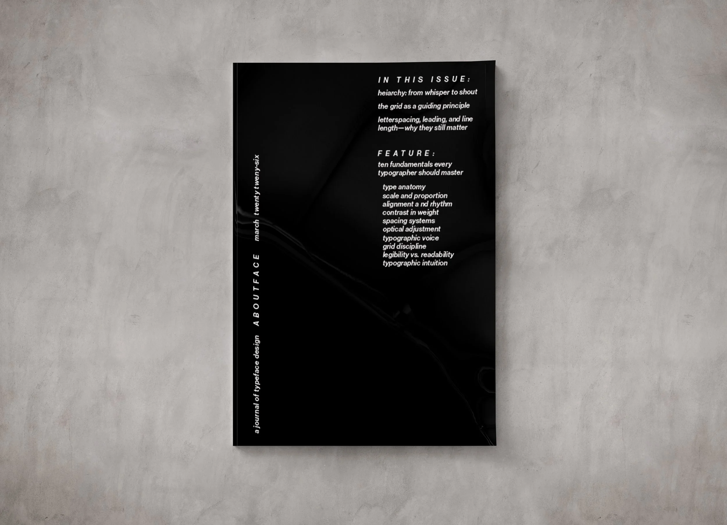
One Size, One Weight
This design relies on alignment, grouping, and spacing to create hierarchy without typographic contrast. Content is organized to allow readability and balance to drive the composition. I used an italic font to introduce a sense of movement within the otherwise static layout and set the title in all caps with adjusted tracking to make it stand out. The same style was applied to the “In This Issue” and “Feature” headers to maintain consistency throughout the design.
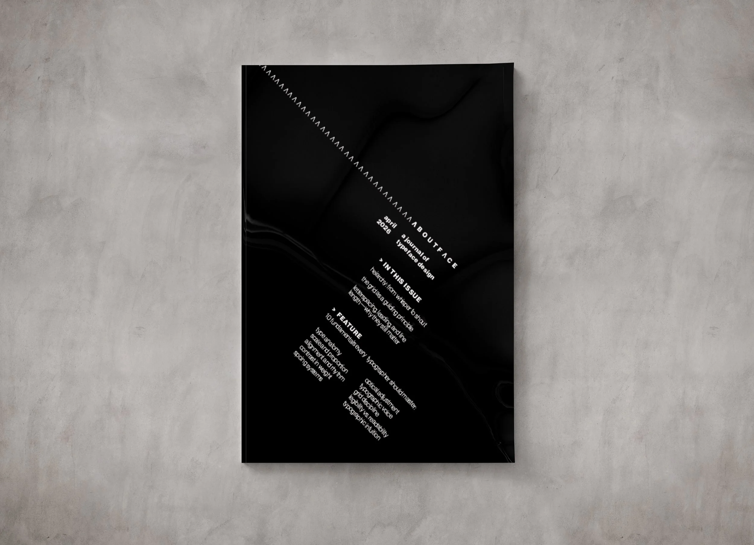
One Size, Two Weights
In this design, I introduced a slanted layout to create a sense of movement and energy. The A’s in AboutFace were replaced with inverted V's to add an element of something unexpected, which is echoed through the use of > symbols in the “In This Issue” and “Feature” headers. Using two weights, I emphasized the title, subtitle, date, and headers to strengthen hierarchy and guide the reader through the layout.
Two Sizes, One Weight
For this design, I focused on the lowercase a as the focal point, using it as the second font size to create emphasis and hierarchy. By enlarging this single character, it becomes both a focal point and a structural element within the composition. The title, subtitle, and date are placed within this form, allowing the letter to frame the most important information while maintaining clarity.
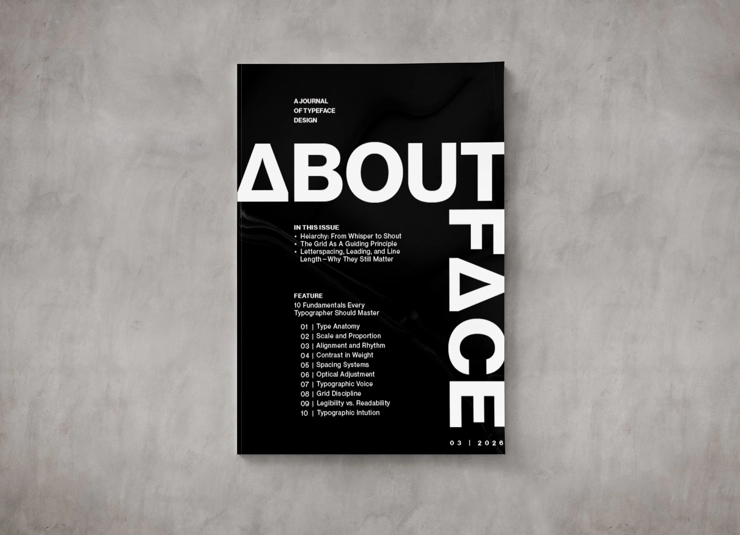
Two Sizes, Two Weights
In this design, text is aligned with the edge of the “B” to create structure and consistency throughout the layout. The altered “A” introduces an element of surprise and visual interest within the otherwise controlled typography. The AboutFace title leads the viewer’s eye naturally to the date, creating a sense of flow and movement through the composition.